BRINK! ORGANIC KOMBUCHA
Client: Personal Project | Project Role: Illustration, Brand & Art Direction

Project Description
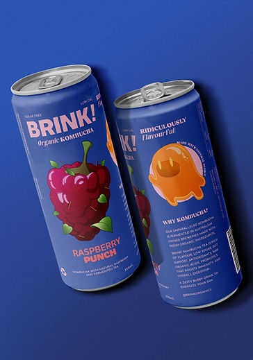
‘Brink!’ is a Melbourne-based kombucha brand that focuses on premium organic beverages. Through cutting-edge experimental and traditional brewing techniques, ‘Brink!’ has reinvented kombucha while preserving its natural, healthy benefits. The design aims to make the Melbourne-based brand feel friendly and quirky with a hint of raw energy of the Tokyo Shibuya district. In hopes to appeal to young adults and fans of sweet, flavourful beverages.
Project Solution
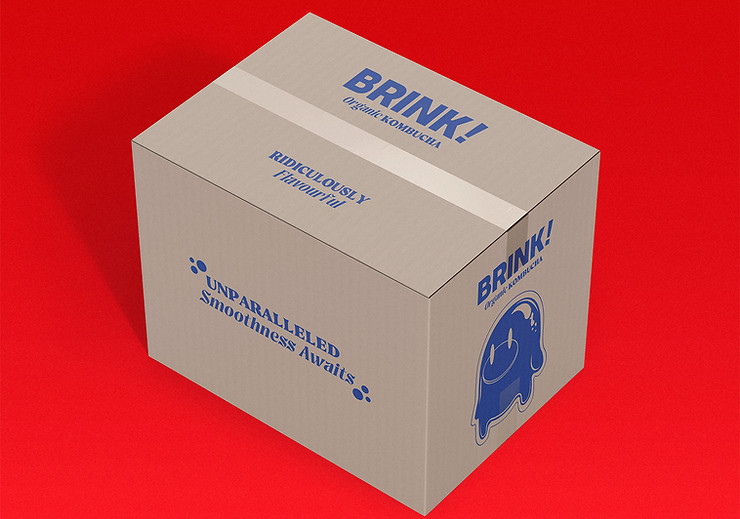
The design communicates a fun and lively image by integrating an animated mascot who is of a SCOBY (Symbiotic culture of bacteria and yeast). Designed to visually demonstrate the brewing process of kombucha in an exciting way. The illustrative approach further communicates the brand’s offbeat playfulness while making the beverage attractive and approachable. The bright colour palette of each flavour is implemented to make ‘Brink!’ beverages feel quenching and appetising, while the illustrations dominate the design hierarchy to further the brand's playful image.